
A restaurant menu is not just a list of items.
It is a sales tool.
It tells guests what you offer, but it also shapes what they notice, what they value, what they compare, what they crave, and ultimately what they buy.
That means menu design is not just about looking nice. It is about guiding decisions.
A well-designed menu can help increase average check, steer guests toward higher-margin items, reduce ordering confusion, improve speed of service, and make the restaurant feel more professional.
The key is understanding how guests actually make decisions.
They scan. They compare.They look for cues. They avoid risk. They are influenced by placement, wording, design, price structure, and what seems popular or special.
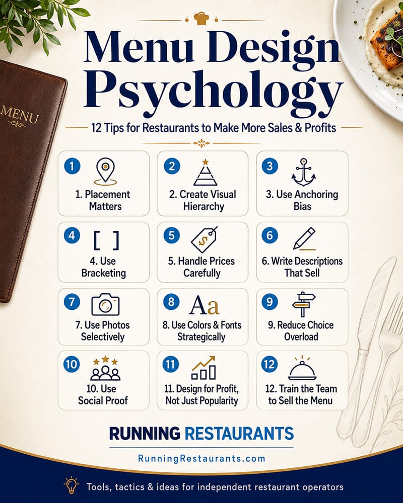
Here are several menu design and persuasion principles independent restaurant operators can use to make the menu work harder.
1. Placement Matters More Than Most Operators Think
Guests do not give every item equal attention.
Where an item appears on the menu affects how likely it is to be noticed and ordered. High-value real estate should be reserved for items you actually want to sell.
That usually means signature items, profitable items, popular items, or items that help define the brand.
Depending on the format, guests often scan the top of a section first. They also notice boxed items, featured callouts, photos, and items separated from the crowd. On a printed menu, the upper areas of panels often get attention. On digital menus, the first few items in a category matter because guests may not scroll deeply.
This is why operators should be careful about simply listing items in whatever order they were created.
The first item in a category should not be random.
If your most profitable appetizer is buried in the middle of a long list, you are making it harder to sell. If your signature entrée is hidden below less important items, you are wasting a chance to guide guests.
Practical move: Review each menu section and ask, "What do we most want guests to notice here?" Then place those items where attention is strongest.
2. Do Not Give Every Item the Same Visual Weight
A menu where everything looks equally important usually makes nothing stand out.
If every item has the same font, same layout, same description length, same spacing, and same visual treatment, the guest has to do all the work.
Good menu design creates hierarchy.
That means the menu should help guests understand:
- what is popular
- what is signature
- what is new
- what is premium
- what is shareable
- what is a strong value
- what is best for first-time guests
You can create hierarchy with boxes, icons, bold item names, callout labels, photos, section headers, spacing, or short feature notes.
But be careful. If you highlight too many items, the highlights stop working.
A good rule: each section should have a small number of intentional features, not a dozen "must try" items.
Practical move: Pick one to three items per major section to visually emphasize. Make sure those items are profitable, operationally reliable, and brand-relevant.
3. Use Anchoring Bias to Make Prices Feel More Reasonable
Anchoring bias is the idea that people judge prices partly based on the first or most prominent number they see.
In menu design, this means a premium item can influence how guests perceive the rest of the category.
For example, if your steak section includes a $49 premium ribeye, a $32 entrée may feel more reasonable next to it. If the highest-priced item is only $29, that same $32 item may feel expensive.
This does not mean you should fake expensive items or manipulate guests with unrealistic pricing. It means your menu structure can help frame value.
Premium items can serve several purposes:
- They attract guests who want the best.
- They raise the perceived quality of the menu.
- They make mid-tier items feel more approachable.
- They create an opportunity for higher check averages.
This is especially useful with wine lists, cocktails, steaks, seafood, tasting boards, family meals, and catering packages.
Practical move: Consider whether each major category has a premium anchor item. It should be legitimate, high quality, and worth the price.
4. Use Bracketing to Give Guests Easy Choices
Bracketing means offering items in multiple sizes, tiers, or formats so guests can choose based on appetite, budget, or occasion.
Examples:
- small / large salad
- half / full portion pasta
- 6 wings / 12 wings
- regular / premium margarita
- individual / family-size entrée
- standard / deluxe catering package
- classic burger / signature burger / premium burger
This works because guests like options, but not too many options.
Bracketing helps guests self-select. Some will trade down, some will trade up, and some will choose the middle option because it feels safe.
The middle option is especially powerful. In many cases, guests avoid the cheapest choice because they do not want to feel cheap, and they avoid the most expensive choice because they do not want to overspend. The middle tier becomes the comfortable decision.
This is why three-tier pricing can work well:
- good
- better
- best
For example, a catering menu might offer:
- Classic Package
- Signature Package
- Premium Package
Many buyers will choose the middle option if it feels like the best balance of value and quality.
Practical move: Look for menu areas where size or tier options could increase flexibility and encourage trade-up decisions.
5. Be Careful With Dollar Signs and Price Formatting
Pricing presentation affects perception.
Menus that use large dollar signs, columns of prices, or visually dominant numbers can make guests focus too much on cost. That can lead them to scan for the cheapest item instead of choosing based on desire.
Many restaurants soften price presentation by removing dollar signs and avoiding price columns.
For example:
Instead of:
Chicken Marsala ................................ $24.99
Use:
Chicken Marsala
pan-seared chicken, mushrooms, marsala wine sauce, garlic mashed potatoes
24
This keeps the focus on the dish, not the price.
That does not mean hiding prices. Guests should never feel tricked. Prices should be clear. But they do not need to be the loudest part of the menu.
Also, consider whether .99 pricing fits your concept. In some casual environments, 14.99 may feel normal. In others, 15 may feel cleaner and more confident.
Practical move: Review whether your current menu design pulls the eye toward price first. If it does, redesign the layout so the item and description lead.
6. Descriptions Should Sell, Not Just Explain
A menu description should do more than list ingredients.
It should make the item easier to imagine, easier to trust, and more appealing to order.
Weak description:
Grilled Chicken Sandwich
chicken, lettuce, tomato, mayo
Stronger description:
Grilled Chicken Sandwich
marinated grilled chicken breast, crisp lettuce, vine-ripe tomato, house garlic aioli, toasted brioche bun
The second version creates more value without changing the product.
Good descriptions can communicate:
- cooking method
- texture
- flavor
- origin
- freshness
- house-made elements
- portion cue
- pairing suggestion
- signature preparation
Words matter.
Terms like crispy, slow-roasted, house-made, chargrilled, fresh, hand-cut, creamy, smoky, toasted, herb-marinated, and signature can increase appeal when used honestly.
The warning is not to overdo it. If every item has a 60-word description, the menu becomes exhausting.
Practical move: Give your most important and profitable items stronger descriptions. Use clear, sensory language that helps guests understand why the item is worth ordering.
7. Pictures Can Sell, But They Can Also Hurt
Food photos are powerful.
A great photo can increase desire and reduce uncertainty, especially for online ordering, digital menus, catering, unfamiliar cuisines, desserts, cocktails, and signature items.
But bad photos are dangerous.
Poor lighting, messy plating, inconsistent portions, or low-quality images can make the food look less appealing than it really is.
Photos also create expectations. If the item arrives looking very different from the picture, trust drops.
For printed menus, too many photos can cheapen the feel of some concepts. For digital menus, photos are often more expected and useful. For online ordering, strong photos can be especially valuable because the guest does not have a server guiding the decision.
Practical move: Use photos selectively. Feature high-margin, high-appeal, visually strong items. Make sure the kitchen can consistently deliver what the picture promises.
8. Colors and Fonts Send Signals
Design choices communicate before the guest reads a word.
A steakhouse menu should not feel like a children's birthday invitation. A modern café should not feel like a legal document. A premium seafood restaurant should not use a cluttered fast-food layout.
Colors and fonts influence perceived quality, energy, clarity, and brand personality.
Warm colors can create appetite and energy. Darker tones can feel more premium. Clean white space can feel modern and confident. Rustic textures can support a comfort-food or farm-inspired concept. Bright colors may work for a fun casual brand but feel wrong for a fine-dining concept.
Fonts matter too.
If the font is hard to read, the menu fails. If the font is too small, older guests struggle. If there are too many font styles, the menu feels unorganized. If the menu looks dated, the restaurant may feel dated too.
Practical move: Use design to support the concept, not distract from it. Above all, make the menu readable in real restaurant lighting.
9. Reduce Choice Overload
More choices do not always create more sales.
A giant menu can slow decisions, increase kitchen complexity, create inventory problems, hurt consistency, and make guests less confident.
Choice overload happens when guests are given too many similar options and cannot easily decide.
This is common in restaurants with:
- too many appetizers
- too many burger builds
- too many pasta variations
- too many modifiers
- too many specials
- too many categories
- too many low-selling legacy items
A tighter menu is often more profitable.
It can reduce waste, simplify prep, speed up training, improve execution, and make ordering easier.
Practical move: Identify low-profit, low-popularity items that clutter the menu. If an item does not sell, does not support the brand, does not generate margin, and complicates operations, it may need to go.
10. Use Social Proof and Popularity Cues
Guests like reassurance.
Labels such as "Guest Favorite," "Most Popular," "House Specialty," "Staff Pick," or "Chef's Recommendation" can help reduce decision risk.
This is especially useful for first-time guests.
A first-time guest often wants to know, "What are you known for?" Do not make them guess.
Social proof works best when it is believable and used sparingly. If half the menu is labeled "popular," the cue loses meaning.
Practical move: Identify a few true guest favorites and label them clearly. Train servers to reinforce those items verbally.
11. Design for Profit, Not Just Popularity
A common menu mistake is promoting bestsellers without considering profitability.
Some popular items are great for the business. Others are margin traps.
Menu engineering requires looking at both popularity and contribution margin. A high-selling item with weak profit may not deserve prime placement. A high-profit item with low awareness may need better positioning, stronger description, or server support.
Operators should know which items are:
- popular and profitable
- popular but low margin
- profitable but under-ordered
- low profit and low popularity
This should shape design decisions.
Practical move: Do not guess. Review sales mix, food cost, contribution margin, prep complexity, and guest feedback before deciding what to feature.
12. Train the Team to Sell the Menu
Even the best-designed menu cannot do all the work.
Servers, bartenders, hosts, and managers need to understand what the menu is trying to accomplish.
If you highlight a signature appetizer, staff should know why. If you create a premium cocktail section, bartenders should know how to describe it. If you add a "guest favorite" label, servers should be ready to confirm it with confidence.
The menu and the service team should work together.
Practical move: In pre-shift meetings, focus on one or two menu items to sell. Give the team simple language and explain why those items matter.
Final Thought
Menu design is one of the most underused profit tools in independent restaurants.
The menu affects what guests notice, what they compare, how they perceive value, how quickly they decide, and how much they spend.
Placement matters.
Descriptions matter.
Photos matter.
Colors and fonts matter.
Price formatting matters.
Anchoring matters.
Bracketing matters.
Social proof matters.
Menu simplicity matters.
Server training matters.
But the goal is not to trick guests.
The goal is to guide them.
A great menu helps guests make better decisions and helps the restaurant sell the items that best support the brand, the operation, and the bottom line.
That is the real power of menu design.
It is not just decoration.
It is strategy on the page.


